TOM BECKBE
Redesign - ShopifyPlus
Tom Beckbe is an outdoor brand founded in 2015, known for its American-made, rugged yet stylish sporting wear. The brand emphasizes quality craftsmanship and durability in all its products.
Overview
Tom Beckbe came to us with the goal of improving site navigation, backend product management, and overall design. Their legacy version of Shopify was limiting the site’s capabilities, and they aimed to upgrade to Shopify 2.0 to overcome these challenges. Key updates were also planned to enhance overall usability and streamline the user experience.
ROLES
Design Exploration
Competitive Analysis
Accessibility
Component Design
Wireframing
Style Guide
Responsive Design
High-Fidelity Design
Dev Handoff
AGENCY
ZaneRay
TIMELINE
2023-24
Challenges
We identified the following issues with the design
Information architecture and navigation
The information architecture lacked effective categorization for optimal navigation. Although they have a relatively small product offering, there were opportunities for enhancement to allow for a more streamlined experience.
CLP design and functionality
The current category landing page (CLP) lacked effective filtering options, which hindered shopability. Additionally, it was not optimized for mobile, making it nearly impossible to purchase products on mobile devices. Given that 55-60% of website traffic comes from mobile devices, optimizing the CLP for mobile was a top priority for the client.
Inconsistent aesthetic and overall design
Inconsistent spacing, typography, and design elements resulted in a less polished presentation for Tom Beckbe.
OPPORTUNITY
How can we enhance the user experience and further develop the Tom Beckbe brand to stand out more distinctly from competitors?
Goals
We analyzed their current challenges to create project goals
Update the information architecture and improve the navigation
Our goal was to optimize the top-level category organization. Existing categories, such as 'Shirts & Polos,' 'Vests,' and 'Jackets,' were organized by product type, but this structure wasn't ideal for a multi-gender audience. Some categories were redundant or unclear, further complicating navigation. Additionally, an extra navigation layer on the category landing page (CLP) created further confusion for users.
Improve the Category Landing page layout and allow for user filtering
The category landing pages would benefit from a design refresh. Product information could be better organized, and the current card design creates a somewhat fragmented layout. Additionally, the pages need to be optimized for mobile, and the CTAs could be downplayed in this circumstance. Our aim was to refine the card design, enhance the overall layout, and introduce filtering functionality to improve usability.
Enhance design consistency, elevate aesthetics, and distinguish from competitors
We wanted to improve on the design, removing unnecessary elements and maintaining those that created their uniqueness within their niche. We also wanted to create refined components highlighting key properties for the user and focusing on a responsive design strategy.
Update the Information Architecture and Improve Navigation
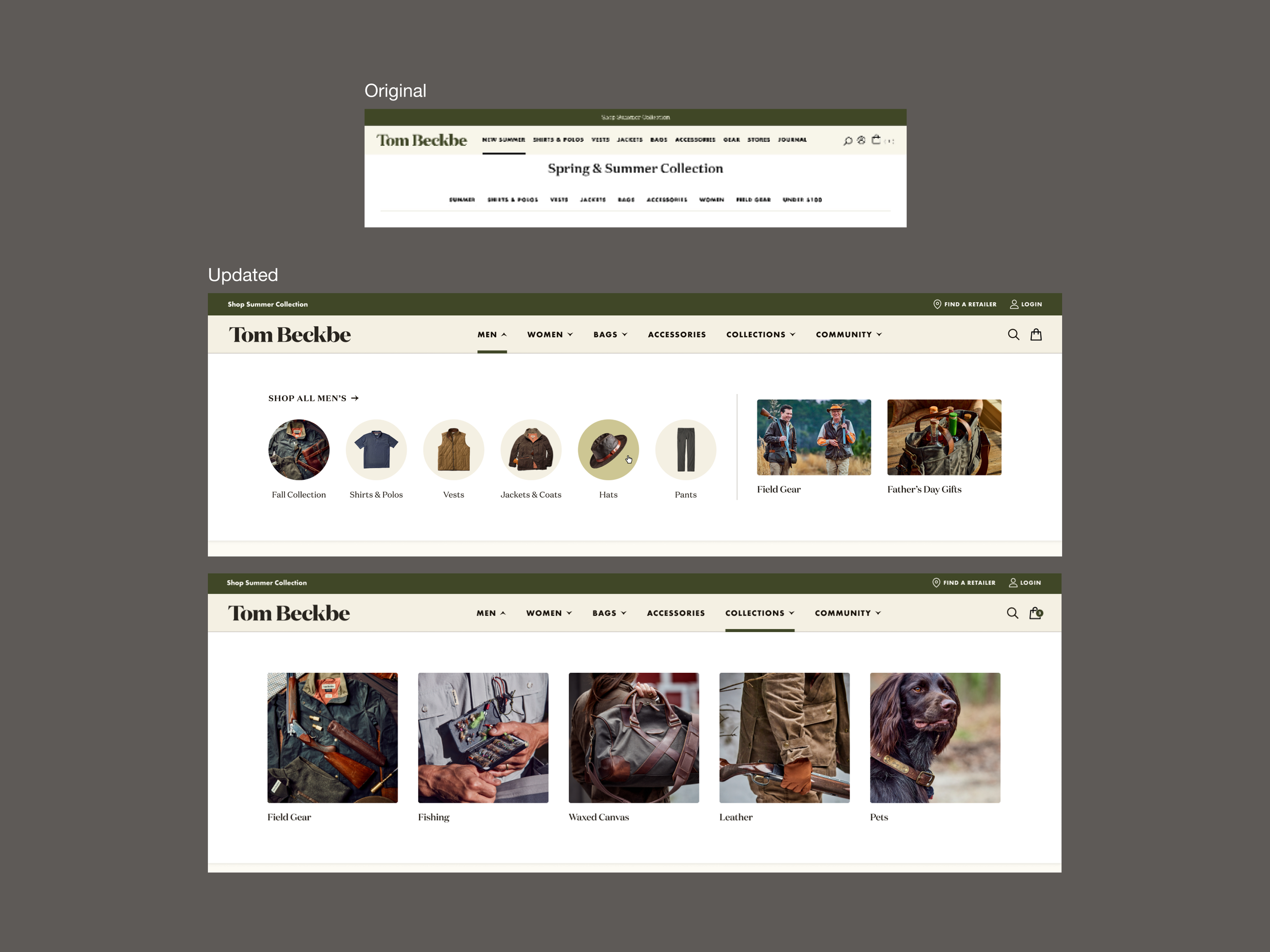
We revamped the information architecture by reorganizing categories like 'New Summer' and 'Shirts and Polos' into broader sections such as 'Men,' 'Women,' 'Bags & Accessories,' and 'Collections.' This new structure enables users to navigate by gender while separately showcasing gender-neutral items like knife holders, fishing rod carriers, and flasks. The 'Collections' section allows Tom Beckbe to feature curated selections based on seasons, special collaborations, and activities. Additionally, we incorporated a visual aspect to the navigation that complements the more streamlined product offering, resulting in a more immersive and engaging design.

Enhance the Category Landing Page with an improved layout and advanced user filtering options
We removed the redundant secondary navigation below the main menu to streamline the user experience. To showcase the high-quality custom lifestyle photography, we introduced a minimal hero banner at the top, ensuring it didn't push the product listings too far down the page. Color blocking was applied to the left of the photo for category headings, avoiding common issues with overlaying text on images and maintaining acessibility. We also refined the product card designs, added filters for color, size, and price, and included an infusion element for special promotions. Adapting this page to a responsive layout was a priority, so we focused on creating multiple breakpoints to accommodate at tablet and mobile sizes.


Improve design consistency, elevate aesthetics, and distinguish from competitors
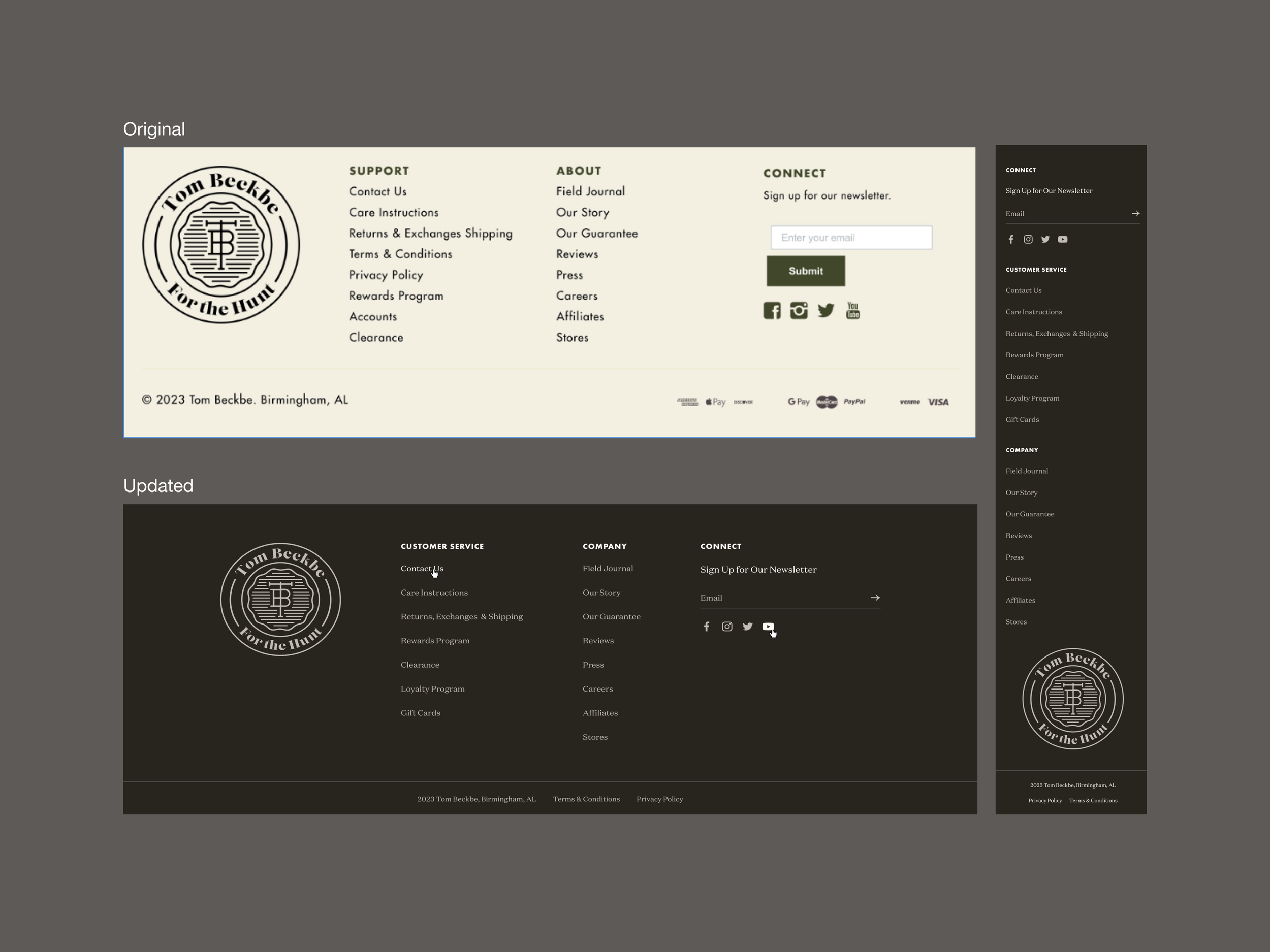
The previous site design contained inconsistent typography, design elements which created a less polished feel. We took a deep dive into our design, identifying areas for improvement and brainstorming innovative new directions. Next, we developed a style guide to ensure design consistency across all elements, including typography, color, icons, and components.


Impact
We successfully migrated Tom Beckbe to Shopify 2.0. This upgrade significantly enhanced site navigation, and backend product management. Improvements to the user experience, by optimizing the site to be responsive, helped them reach a mobile-centric user-base, which was previously only able to shop the site on desktop. Aesthetically, they were pleased with the updates and we continue to work with them on enhancing additional aspects of the site. Overall, we met our clients goals and exceeded their expectations. The client expressed immense gratitude for our expertise and the positive impact it had on their business.

