ROCK & ROLL DENIM
Redesign - ShopifyPlus
Founded in 2003, Rock & Roll Denim blends timeless Western tradition with modern flair. Known for its bold designs and premium quality, it empowers confident, stylish individuals.
Overview
Westmoor, parent company of Rock & Roll Denim, sought to revamp their eCommerce experience to increase conversions and improve the mobile experience. They aimed to differentiate Rock & Roll Denim from their other Western wear lines with a distinct brand refresh and a user-friendly, mobile-optimized website that highlighted its rugged, modern style.
ROLES
Design Exploration
Competitive Analysis
Accessibility
Component Design
Wireframing
Style Guide
Responsive Design
High-Fidelity Design
Dev Handoff
AGENCY
ZaneRay
TIMELINE
Spring – Fall 2024
Design Strategy
We designed the website to evoke the spirit of classic rock and roll posters while maintaining a modern, fresh feel. Drawing inspiration from bold, iconic visuals, we created custom promotional elements that captured the energy and nostalgia of the genre. These elements offered multiple content options, allowing for dynamic layouts that avoided a templated, rigid look. The result was a more free-flowing design that reflected the brand’s rebellious spirit and gave the site a unique, personalized feel, enhancing user engagement and delivering a memorable online experience.
Dynamic Category Navigation
We aimed to enhance the homepage with a toggle feature, allowing users to switch between men’s and women’s categories for a more tailored experience. This way, the homepage dynamically displays relevant products based on the selected gender, making it easier for users to find what they’re looking for and creating a more engaging shopping journey.
Light and Dark Mode Functionality
We implemented functionality that enables the client to toggle components between light and dark mode, providing flexibility to adapt the design to different content needs. This feature not only enhances visual appeal but also allows for adjustments in layout flow, ensuring that each mode complements the content style and improves readability. With this capability, the client can easily tailor the user experience, creating a cohesive look and feel across diverse content types.
Style Guide
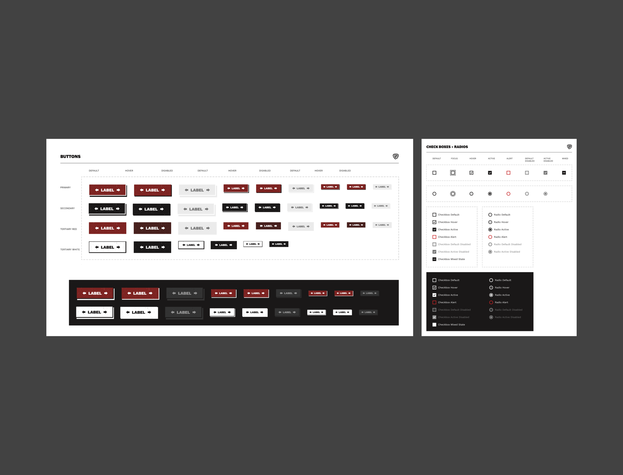
We developed a comprehensive style guide that outlines typography, color palettes, UI elements, and components to create a cohesive design system. This guide serves as a single source of truth, aligning the design team on consistent use of components and visual elements. It streamlines the development handoff by providing clear guidelines and reusable assets, ensuring efficiency and consistency across projects. As we continue to expand the system, the style guide helps maintain design integrity and adaptability, enabling seamless growth and scalability in future builds.
Impact
The project was a success, achieving key goals that have transformed the client’s online presence. We established a distinctive brand identity that sets them apart from competitors and designed a more shoppable, fully responsive website, opening up access for mobile users—a capability their previous site lacked. Enhanced navigational features, including a gender category toggle on the homepage and advanced filtering on category pages, make for an intuitive shopping experience. The client was thrilled with the new look, brand differentiation, and functional improvements, and they are excited to see the impact post-launch.


