DOCA DONE
New Site Design - ShopifyPlus
DocaDone offers versatile, high-quality extension poles and attachments for hard-to-reach tasks like cleaning, painting, and pruning. Their durable, telescoping designs prioritize ease of use for efficient home maintenance.
Overview
DocaDone was exclusively selling its products on Amazon.com. They reached out because they were looking to build a Shopify website, which would allow them to have complete control over the user experience, from the layout and product presentation to the checkout process.
ROLES
Design Exploration
Competitive Analysis
Accessibility
Component Design
Wireframing
Style Guide
Responsive Design
High-Fidelity Design
Dev Handoff
AGENCY
ZaneRay
TIMELINE
Spring – Fall 202
Challenges
Current branding was unimpressionable and inaccessible
The previous DocaZoo brand primarily used shades of gold, which were neither accessible nor effectively adaptable across the website. Additionally, the overall look and feel were difficult to manage on the Amazon brand page.
The information architecture was confusing
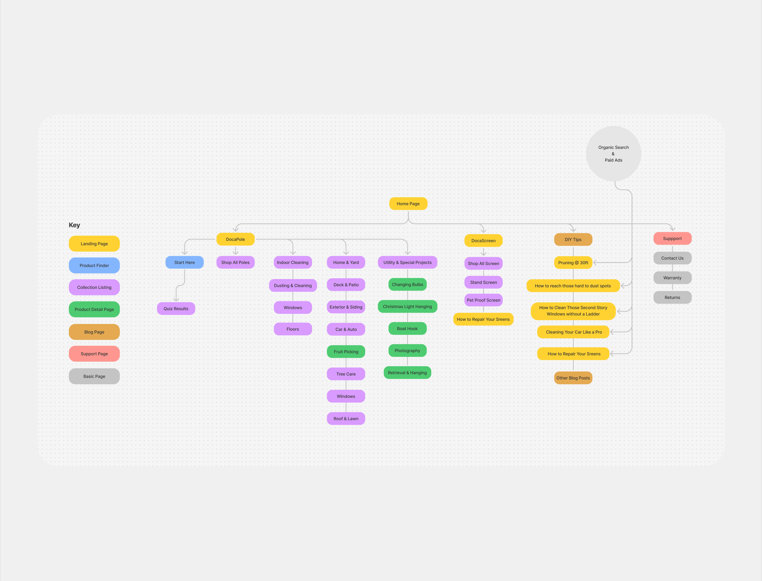
The information architecture was suboptimal. The types of products, including extension poles, attachments, plus unrelated products such as a mouse trap and screen replacements tools weren’t being addressed effectively with the current IA.
Suboptimal filtering and product display pages
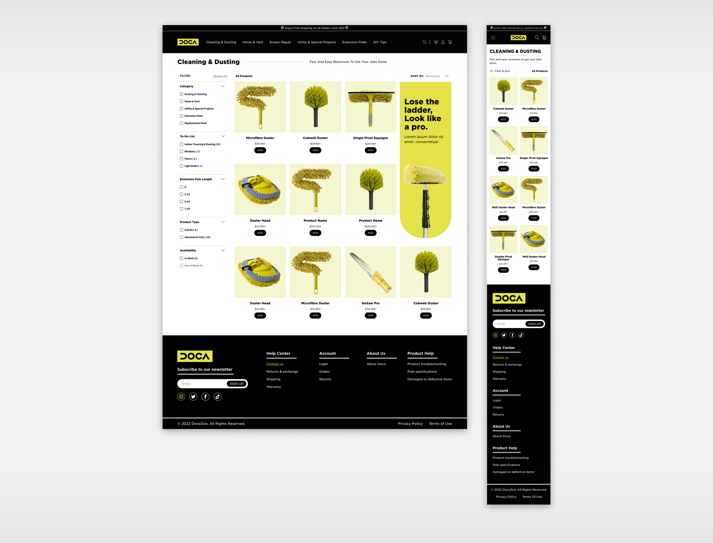
The filtering on the CLP pages failed to supply the user with adequate filtering, making product browsing complicated. The product presentation pages lacked the functionality to add important product features, and the design was unprofessional.
OPPORTUNITY
How can we boost retention and conversion by leveraging brand aesthetics, optimizing information architecture, and improving product filtering and presentation?
Goals
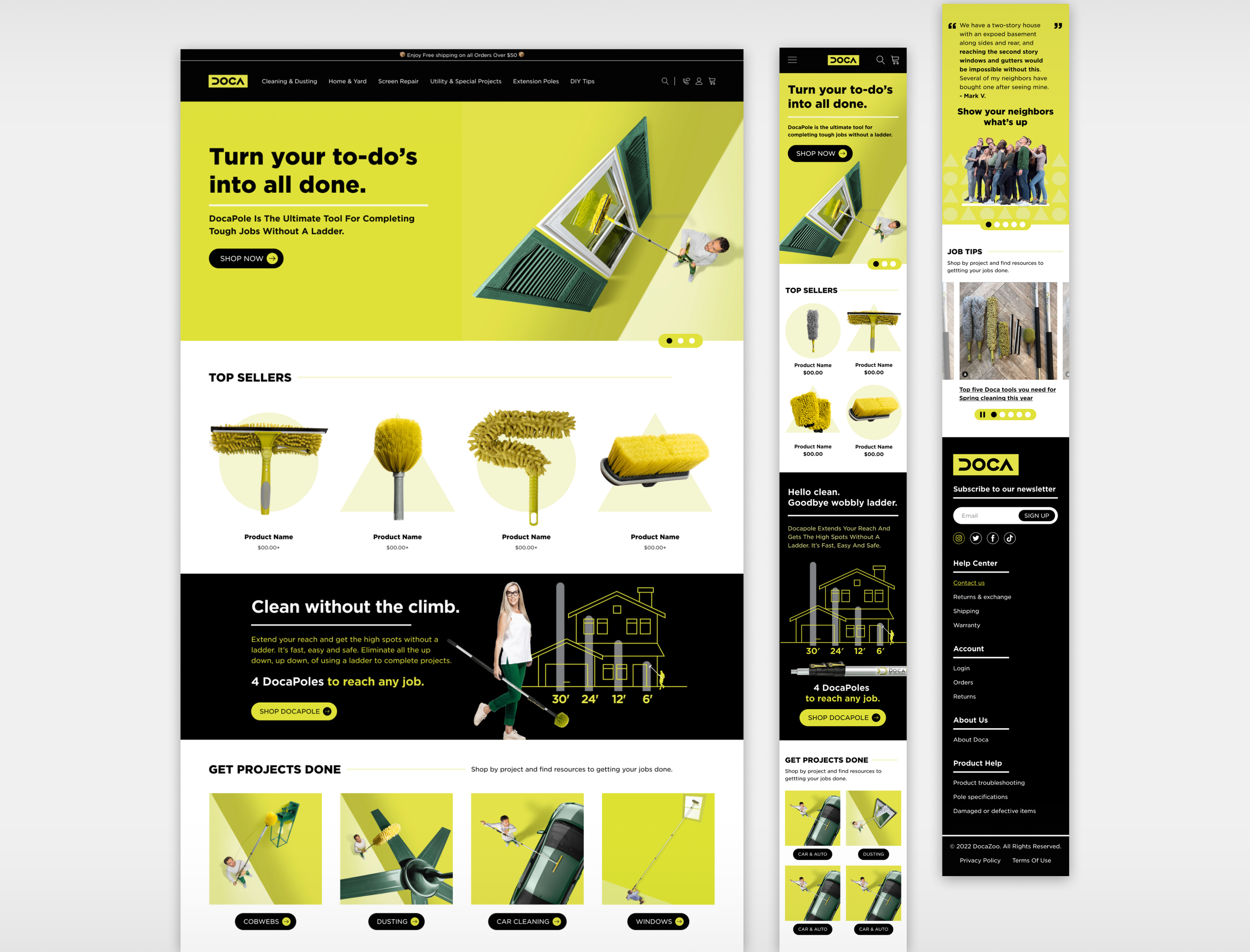
Implement updated branding and improve the user experience
By updating the colors, typography and imagery to be more intentional, while keeping accessibility in mind, we aimed to create a more immersive, consistent experience.
Optimize information architecture
By evaluating the current product offering and refining the architecture, we can create a more streamlined user journey, facilitating product discovery and enhancing overall conversion rates.
Improve product filtering capabilities and product page presentation
Improve the user experience by expanding filtering options to enhance the ability to browse product pages. Update the product detail pages to deliver a more immersive, branded experience, while also highlighting key product features.
Implement updated branding and improve the user experience
The new color scheme for DocaDone made the brand more recognizable by using a bold chartreuse with black accents, creating a strong first impression and setting it apart from competitors with a modern, vibrant look. We built a style guide with the updated styles to streamline dev handoff and ensure consistency throughout the designs.

Optimize information architecture
The DocaDone product offering was extensive, featuring various extension pole lengths, multiple attachments for different uses, and several unique one-off products. Collaborating with the client, we prioritized which products to include on the site and developed a strategy for addressing the one-off items that didn’t seamlessly fit. By approaching this iteratively between our teams, we finalized an information architecture that supports multiple user pathways, ultimately simplifying the shopping experience and optimizing product discoverability.

Improve product filtering capabilities and product page presentation
We conducted a thorough assessment of the filtering options and categorized them based on users' cleaning needs, extension pole length preferences, task-specific requirements, and product types. This helped to streamline the shopping experience. For the product detail page, we integrated distinctive brand elements, including unique shapes and colors, to create an engaging and memorable user experience. This approach not only enhanced usability but also strengthened brand identity throughout the shopping journey.

PDP Design Strategy
We designed the Product Detail Page (PDP) with a focus on flexibility and user engagement. To accommodate different customer needs, we offered the option to purchase either the attachment alone or multiple pole sizes as part of the selection process. This streamlined the shopping experience while ensuring users could easily customize their purchase.
The PDP also featured multiple cross-sell items, enhancing the chance for additional sales and improving the overall shopping journey. To highlight key product features, we creatively incorporated the brand's signature shapes, using them to frame the information in a visually appealing way. Additionally, we applied a unique photographic technique that made the product images "pop" out of the shapes, drawing users' attention and making the visuals more dynamic.
Overall, the client was pleased with the enhanced functionality, the clever integration of brand assets, and the positive impact on user engagement and sales.
Impact
The DocaDone rebrand and site design were an overall success. The implementation of the updated styles created an engaging user experience and helped to define the brand’s presence. Addressing issues with the information architecture and filtering options streamlined the shopping experience. Additional unique features on the product detail page made the shopping experience more engaging and created more accessible information. These updates positioned DocaDone for continued growth and customer satisfaction moving forward.


