JACKSON HOLE
Redesign + UX Strategy
Jackson Hole Mountain Resort, a top Wyoming ski destination, is known for challenging terrain with steep slopes and deep powder. Popular with expert skiers, it offers 4,000+ vertical feet of skiing.
Overview
Jackson Hole was looking to revamp their website's aesthetic, enhancing both the user experience and purchase journey. We proposed focused on optimizing navigation pathways, refining page hierarchy and layout, and updating typography and visual elements.
ROLES
Design Exploration
Competitive Analysis
Accessibility
Component Design
User Journey Mapping
Wireframing
Style Guide
Responsive Design
High-Fidelity Design
Dev Handoff
AGENCY
ZaneRay
TIMELINE
2022-23
Challenges
We identified 2 primary issues with the previous site design
Aesthetics needed an update, page elements were distracting
The homepage featured multiple calls-to-action, which may have made it challenging for users to focus on key messages. Some inconsistencies in page elements and a lack of clear differentiation between editorial and promotional content could have contributed to a less streamlined user experience.
The purchase journey was complex
Key pages providing information on available mountain activities could benefit from improved organization to enhance the user flow. Additionally, the placement of CTAs may have impacted the overall conversion experience.
OPPORTUNITY
How can we create a more engaging and efficient user experience that optimizes user conversions?
Goals
We converted our key challenges into opportunities to solve for during the redesign
Update homepage components and page aesthetics
The redesign should prioritize key improvements to the homepage and supporting pages, focusing on enhancing the user experience by minimizing distractions, clearly separating promotional and editorial content, and refreshing the overall aesthetic.
Simplify the research process and improve user conversion
The experience should provide users with easy access to the information they seek while supporting conversions at all stages of the discovery process.
Update Homepage Components and Page Aesthetics
We recommended replacing the hero image with an immersive sizzle reel to better engage users upon visiting the site. Navigation and weather information were simplified, and quick-hit stats were added to the top right for easy access. A cohesive theme using negative space, framing, and indentation was applied throughout the design to set the site apart from competitors. This approach also eliminated the need for headlines overlaid on images, which often resulted in unreadable callouts.
Component Design Strategy
The components below the hero image were reorganized to improve the user experience. The Experiences carousel was moved to the top, just below the hero, allowing the main sizzle reel to take center stage and focus users on booking trips. This move shifted the carousel from a distracting position in the previous design and allowed Jackson Hole to curate the featured elements.
To distinguish Events and Experiences from Blog content, we adjusted image aspect ratios and applied a dark theme to event sections, creating a clear visual distinction between editorial and activity content.
These updates reduced cognitive overload, streamlined the homepage, and created a more focused user experience by limiting the number of events and options presented, while also using whitespace and image sizing to make the experience more immersive.
Style Guide
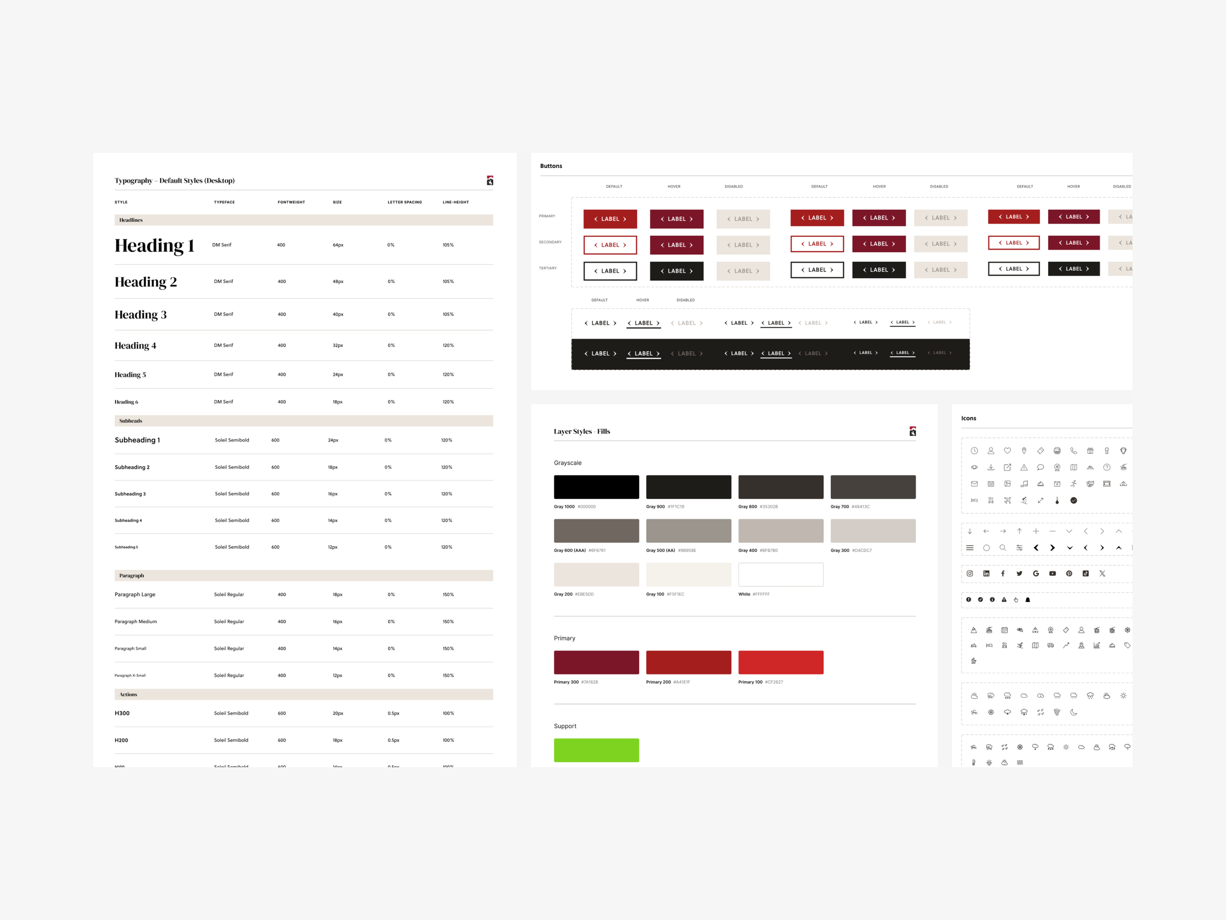
We refined the existing style guide with key updates to ensure consistency and efficiency while preserving core design elements. Typography was enhanced to reflect an upscale Western charm, and various elements were reskinned to align with the new design direction. New components were also introduced where necessary to improve user interaction.

Activity Pages Optimization
We've enhanced the Activities Landing Page by adding filters to help users easily navigate the numerous options. Each activity card now includes key details like dates, hours, and clear CTAs for "Buy Now" and "Learn More." This allows users to quickly find relevant activities and either make a purchase or explore more information.
We've significantly improved the Activity Detail Pages. To showcase the full experience, we've added a hero carousel featuring multiple activity photos. This allows users to easily explore all available imagery.
We've also optimized the purchase process and improved conversion by adding a prominent content section on the right side of the page. This section provides quick access to pricing, key information, and a direct purchase CTA.
For mobile users, we've implemented a sticky bar at the bottom of the page displaying the activity price. Clicking on this bar expands to reveal additional details and a purchase button.
We began by wireframing these concepts before moving into high fidelity designs.


Impact
The redesigned Jackson Hole website was a success. Its clean, modern aesthetic and improved user experience were well-received. We enhanced information accessibility through added features, optimized layout, and prominent CTAs. The purchase process was streamlined to minimize clicks, ultimately improving conversion. Overall, the client was highly satisfied with the updates.


